WONDERWALL
OVO® TOKYO
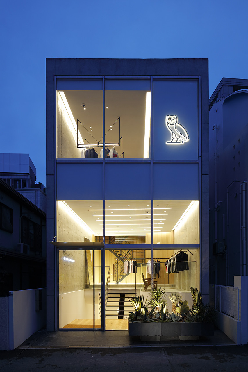
This is the design for the first flagship store in Asia for October’s Very Own, a global lifestyle brand that was established in Canada by Aubrey “Drake” Graham, Oliver El-Khatib, and Noah “40” Shebib.
The brand has deep knowledge in not only street culture but art, and thus requested the theme of this project be “a tribute to Japanese culture and architecture”.
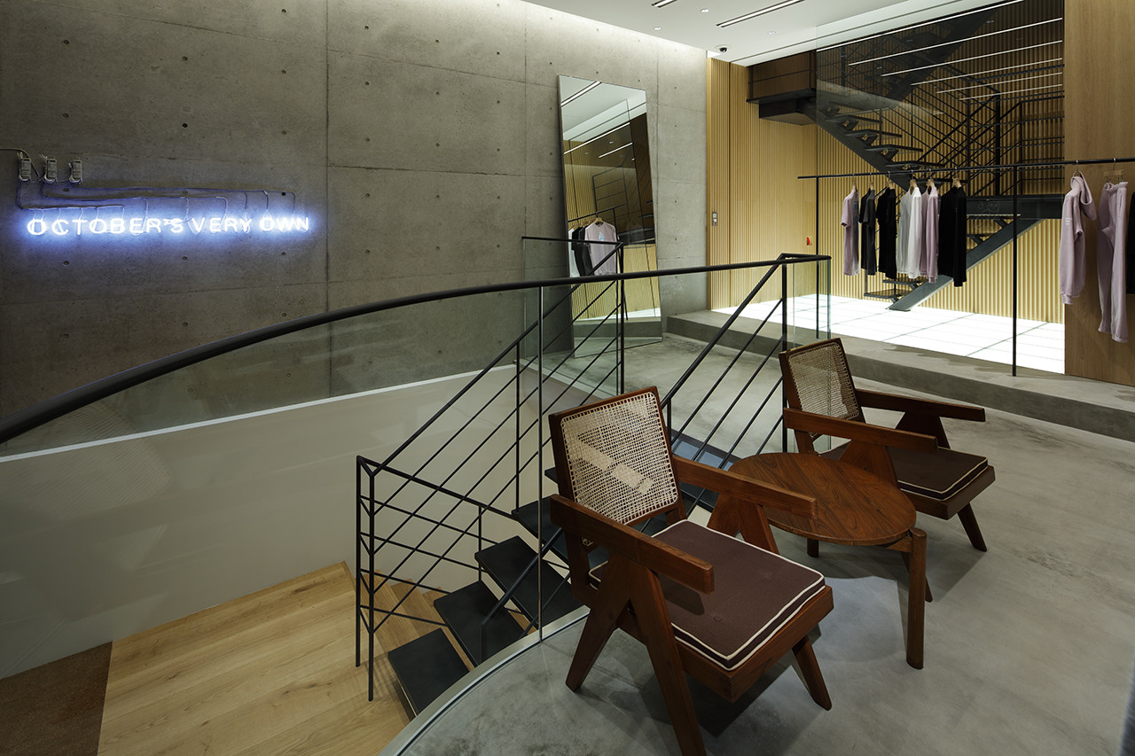
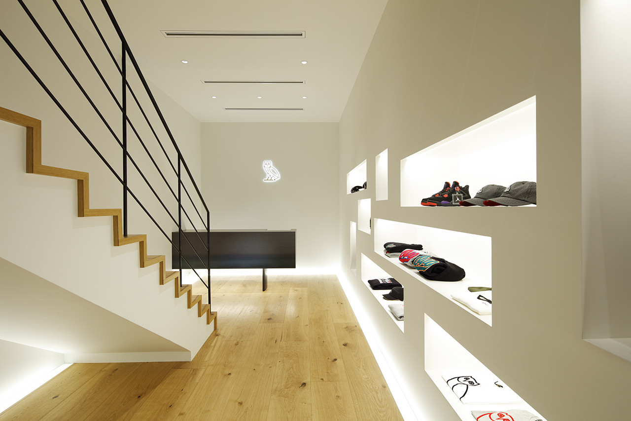
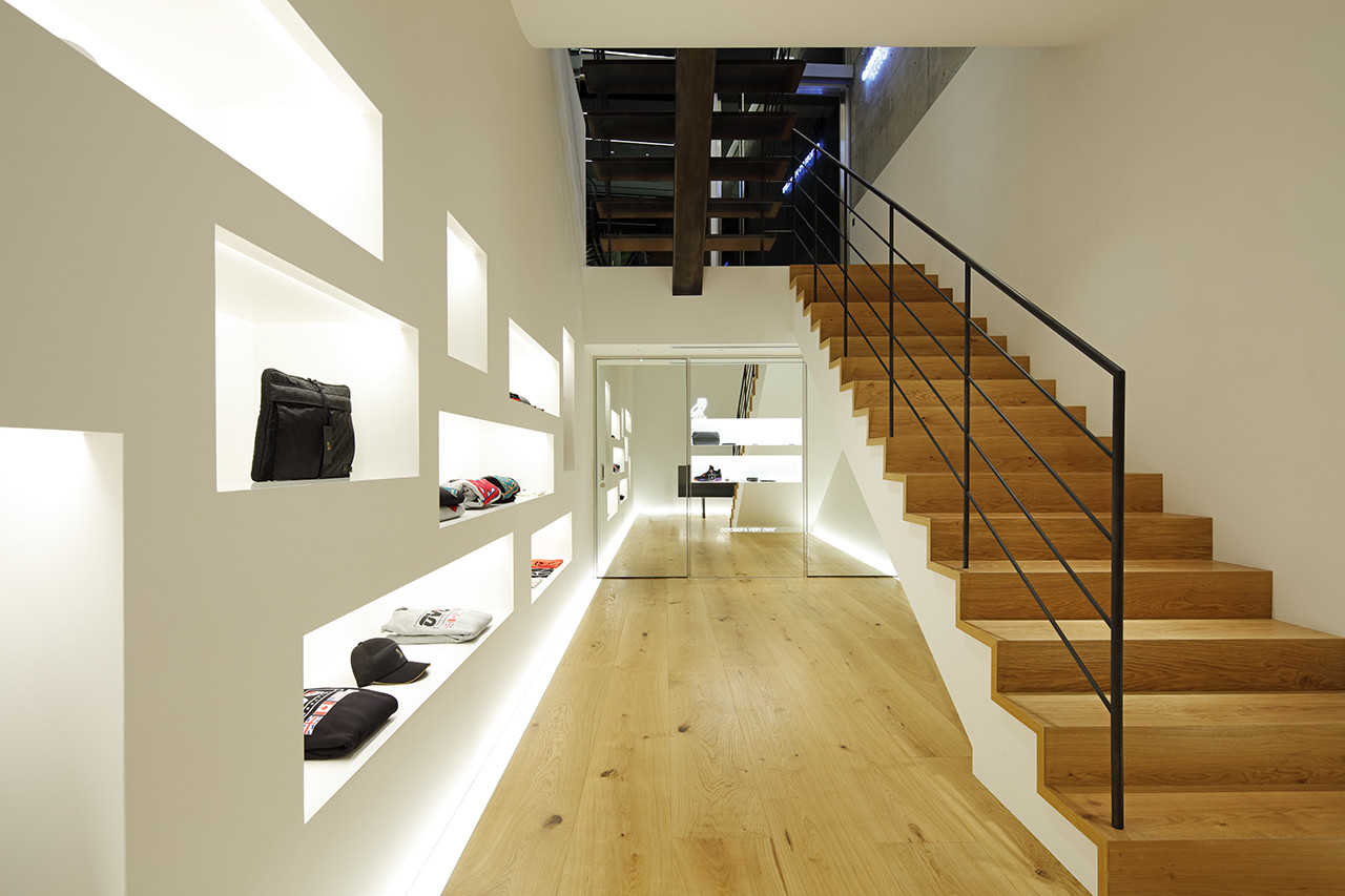
While pursuing a design that would keep up with the simplicity that the OVO brand has cherished so far, we came across “Mono-ha”—an important trend that appeared in the Japanese art world during the late 1960s to the early 70s that could be interpreted as anti-artistic movement—and used this as a source of inspiration for the space.
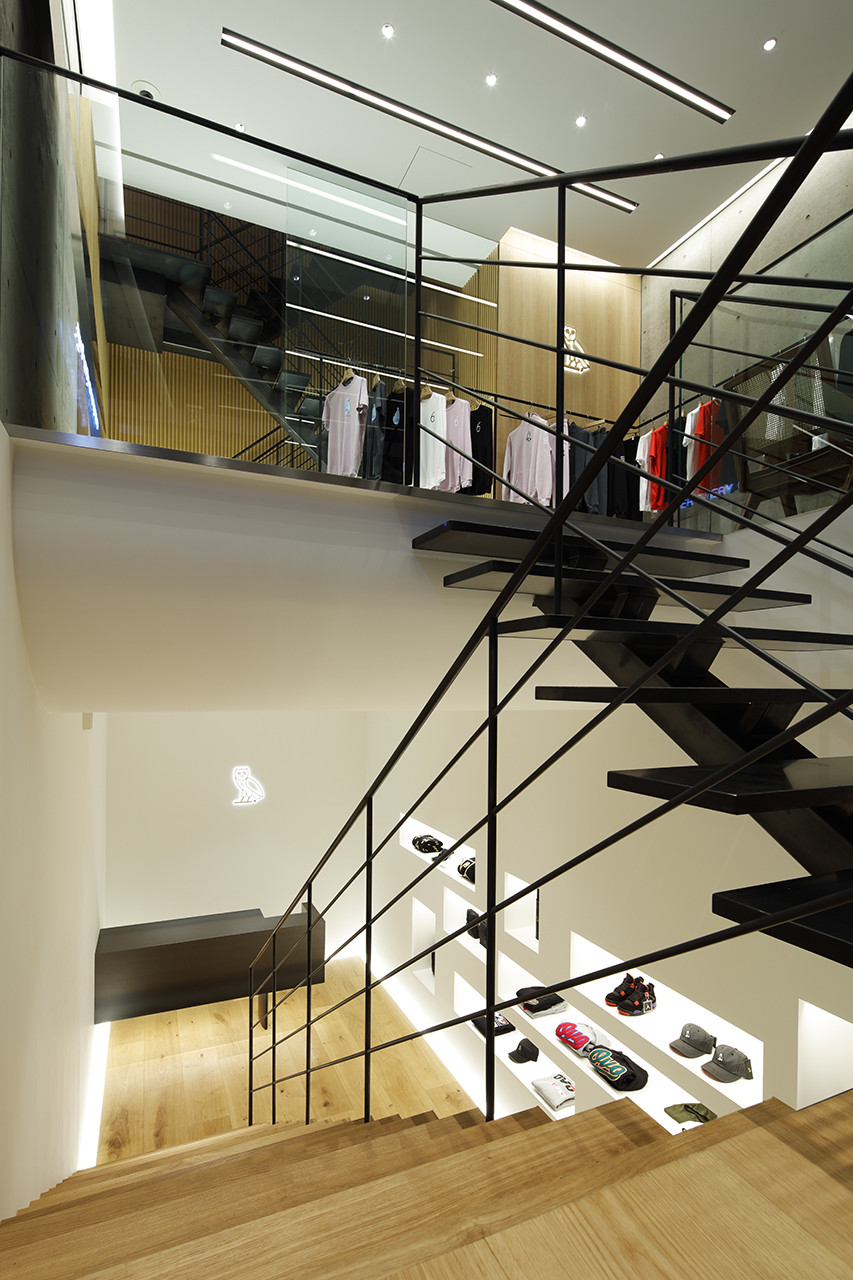
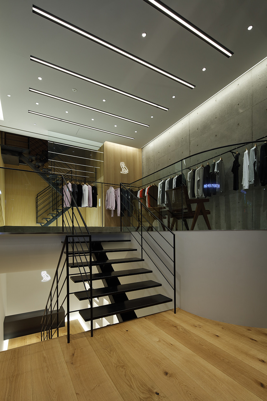
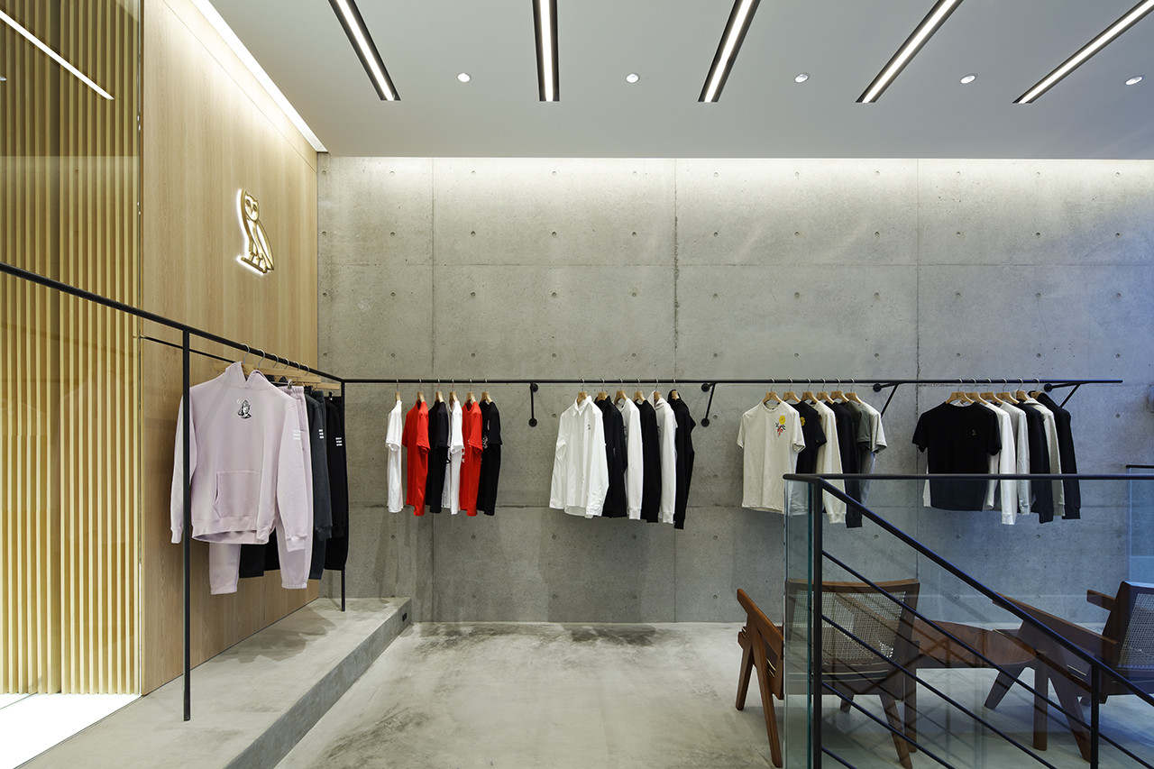
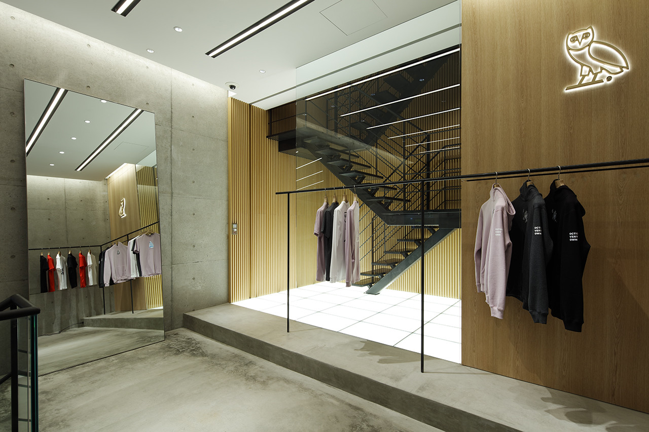
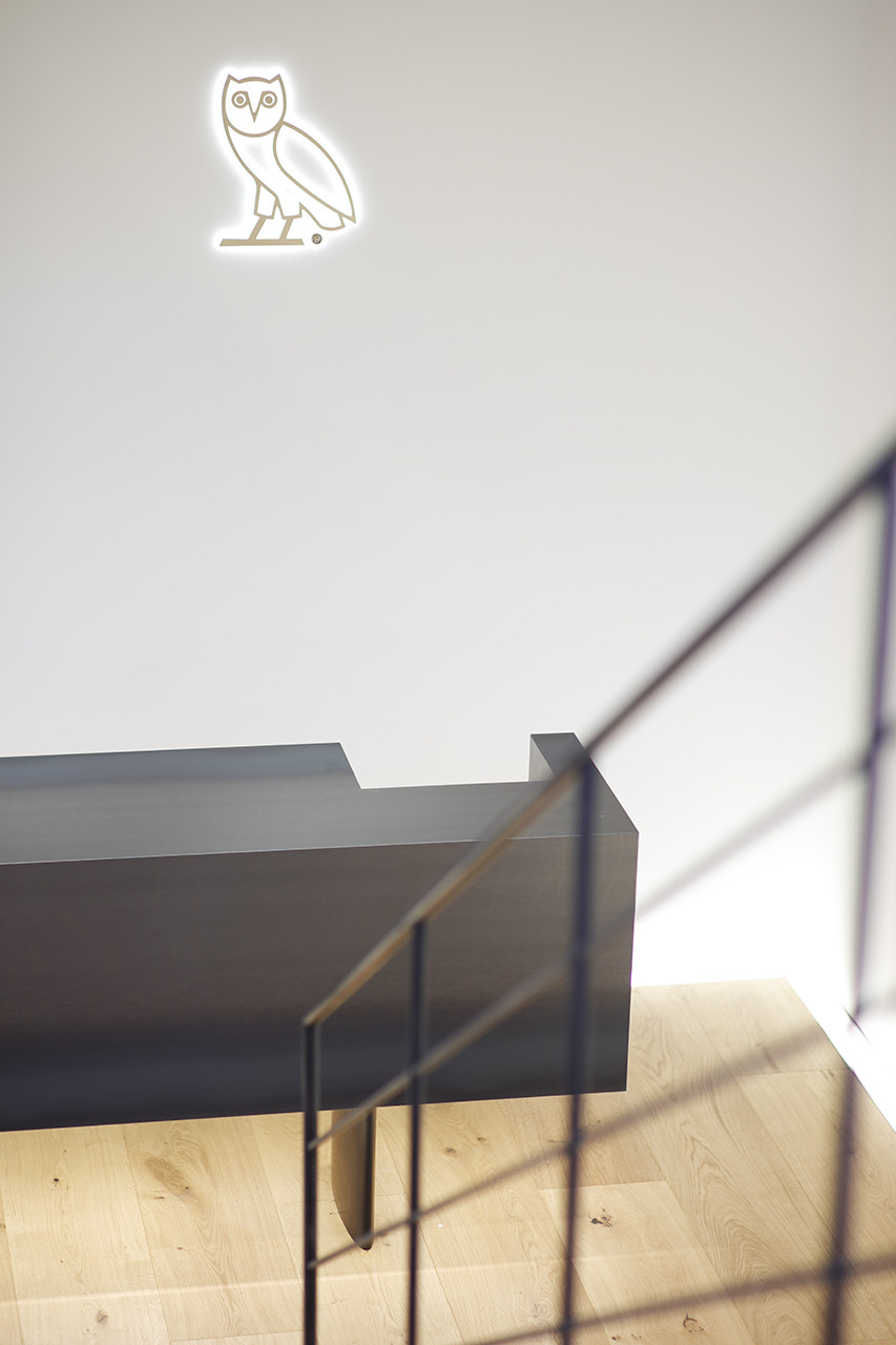
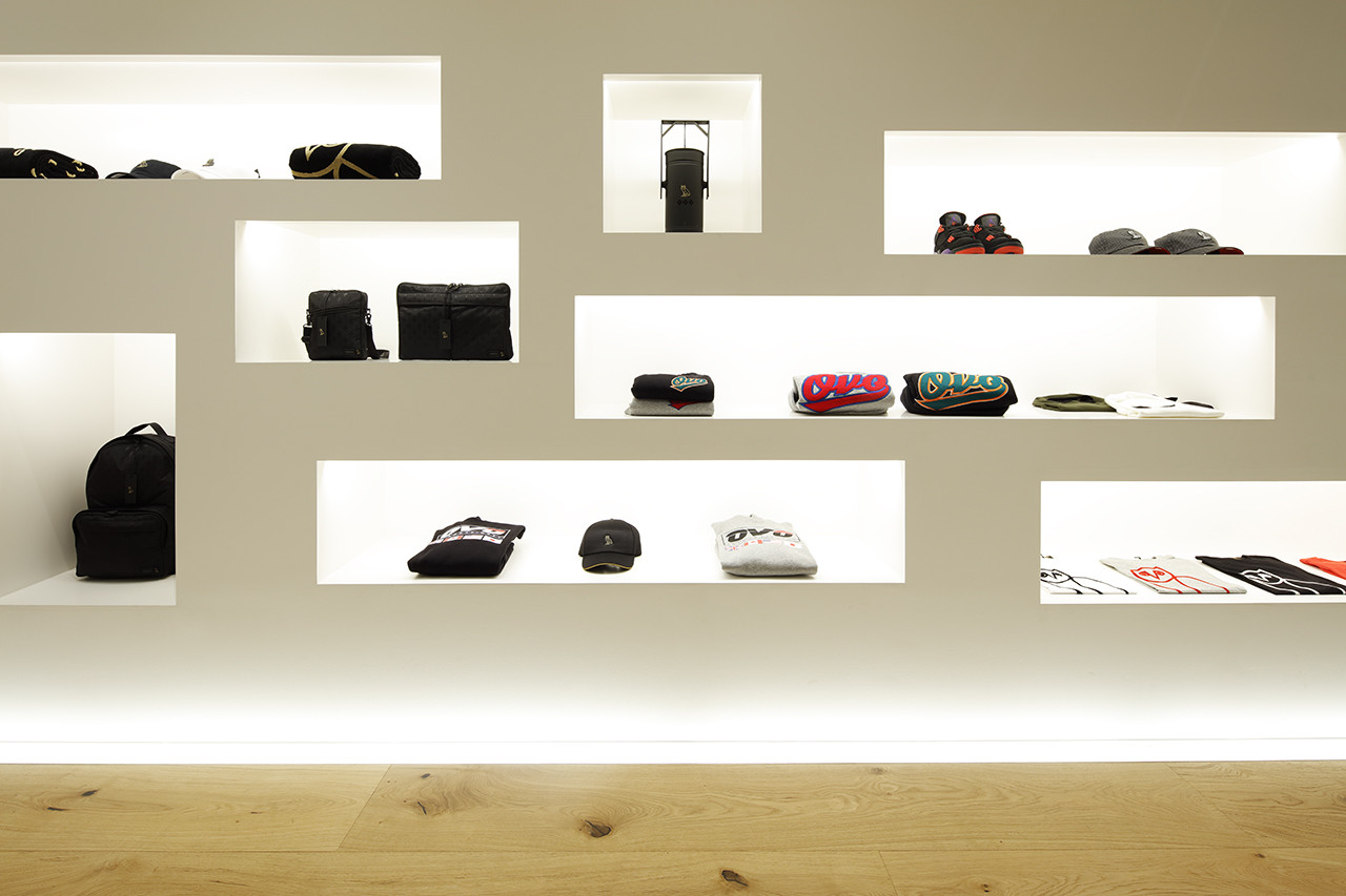
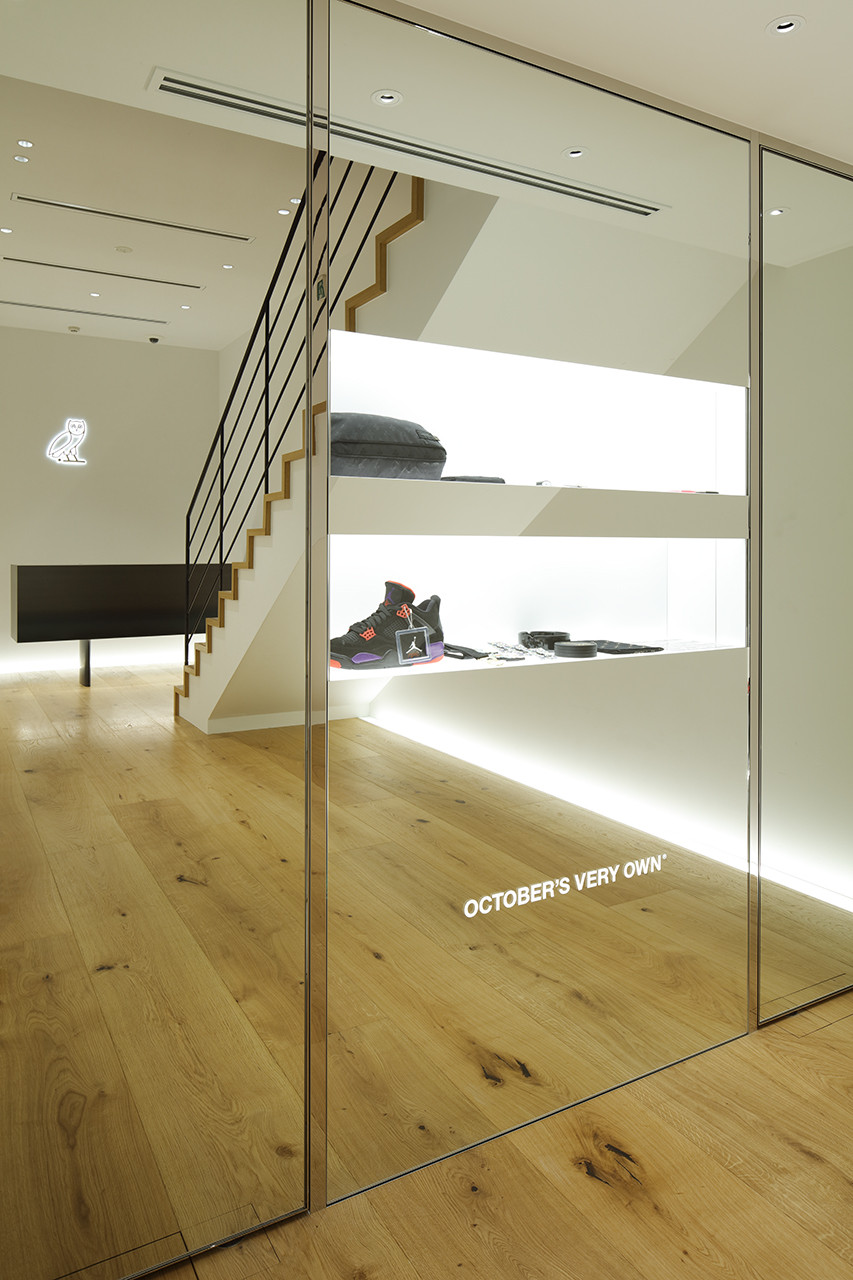
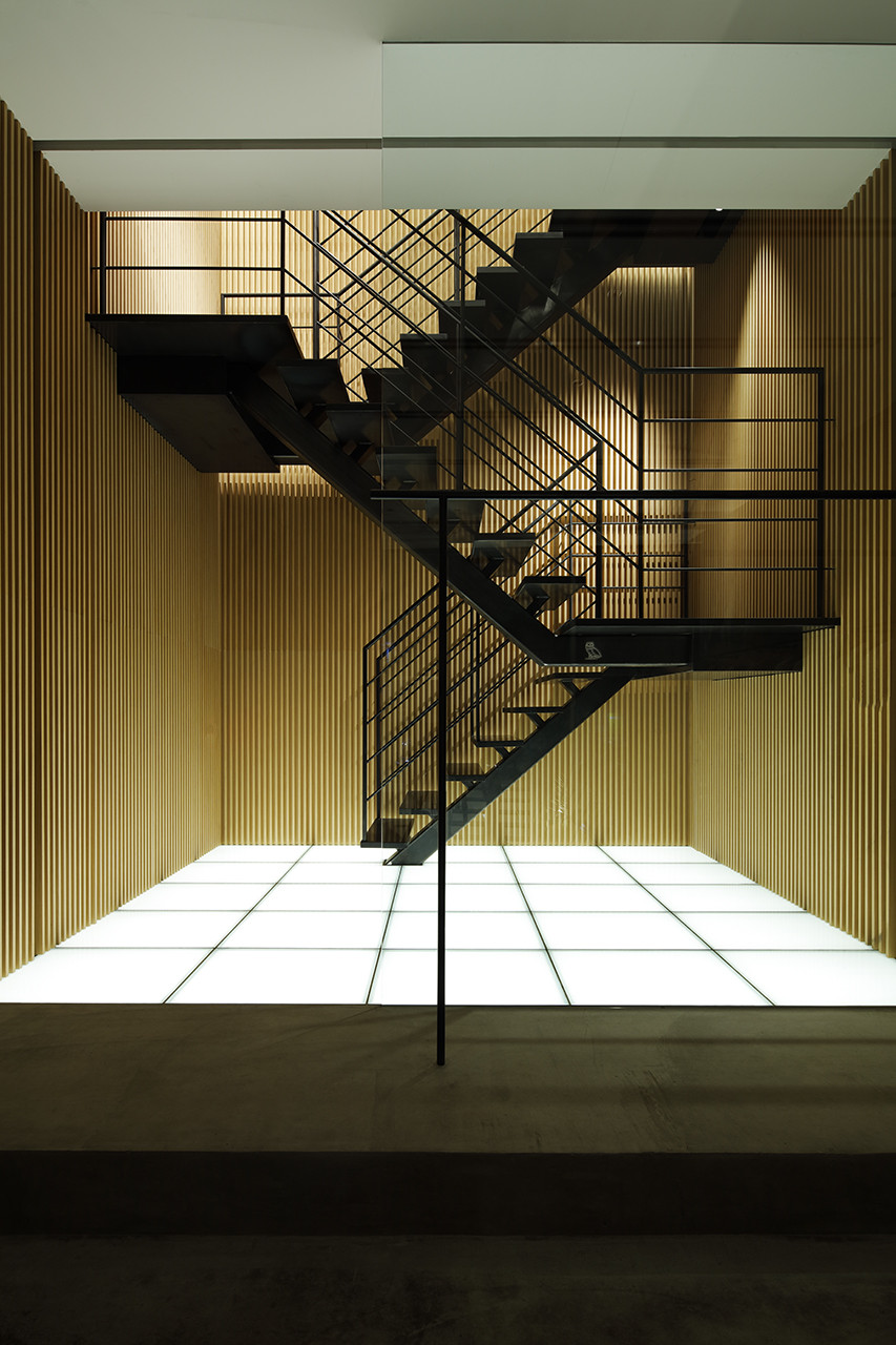
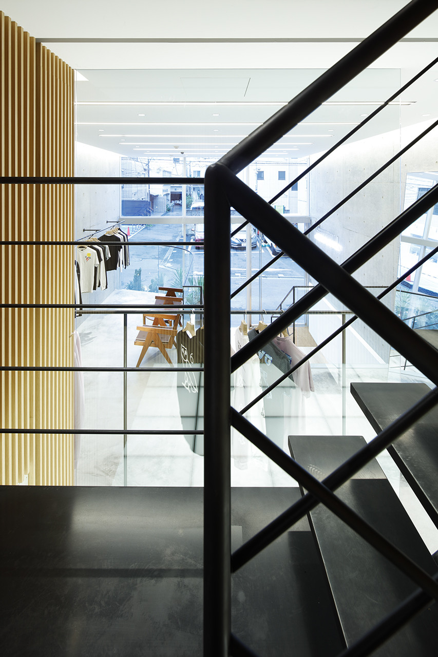
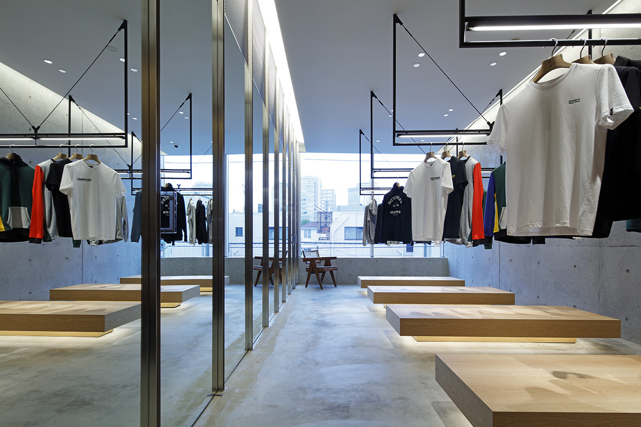
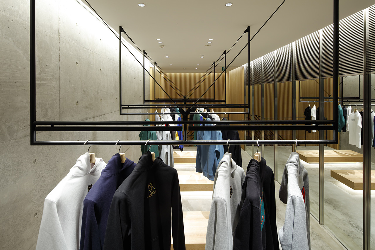
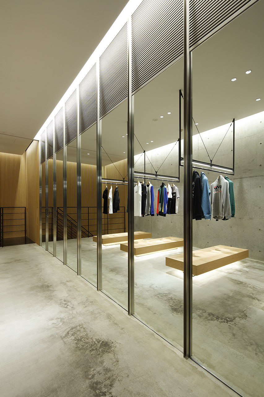
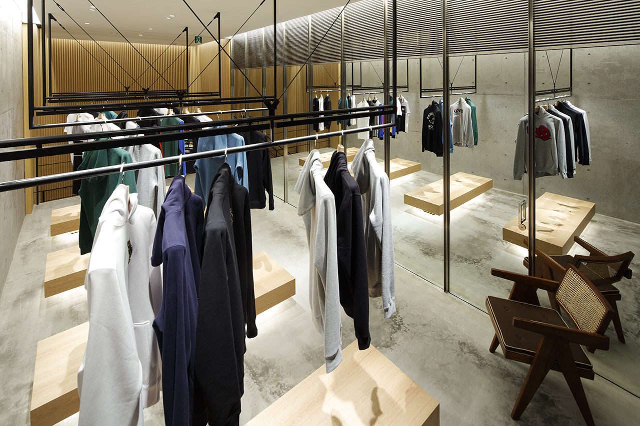
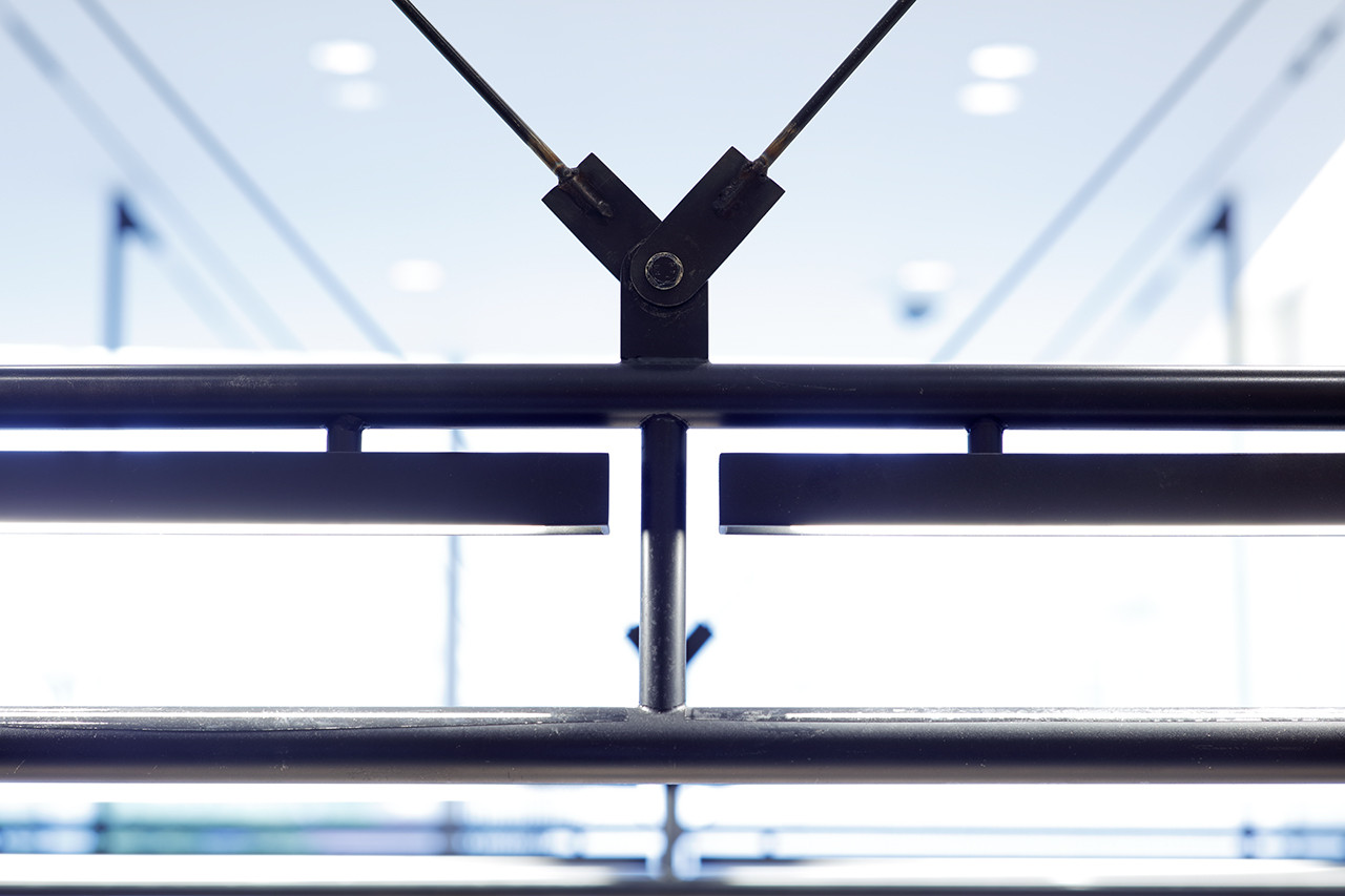
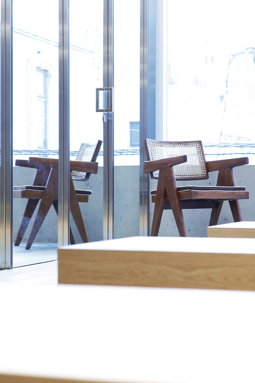
Elements were limited to natural and neutral materials such as concrete, iron, stone, wood, and glass to pursue the idea of “not making”—to not intervene and present them as unadulterated objects—in order to dismantle the conventional subject-object relationship and embrace Japanese ambiguity in the store design.
Also, by regarding an encounter with a given building as ichigo ichie (一期一会, the concept of regarding every encounter as a unique opportunity of a lifetime), we responded to existing materials to create a truly unique situation. A complex structure of three different levels was constructed as three layers that convey the concept of motenashi, or Japanese hospitality, through different experiences.
