WONDERWALL
PIERRE HERMÉ PARIS Aoyama(2016)
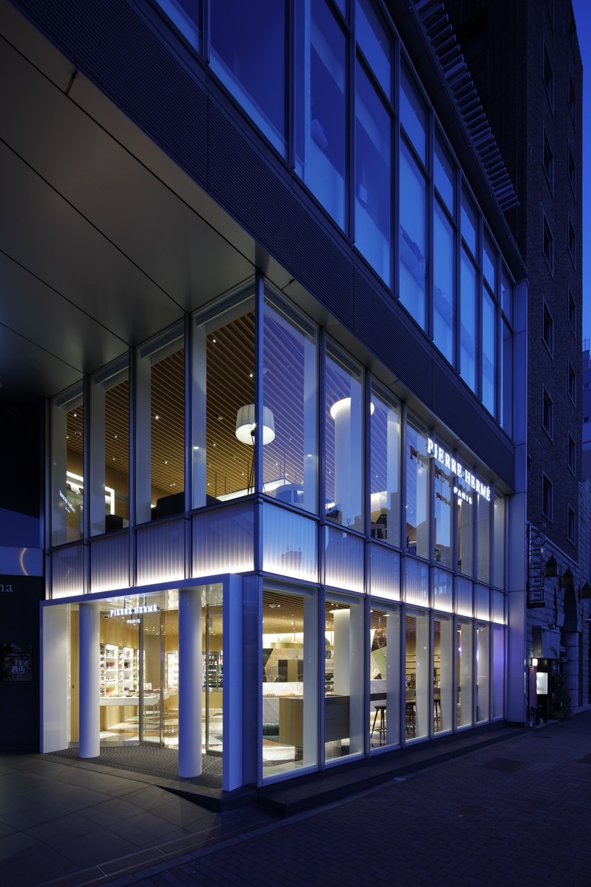
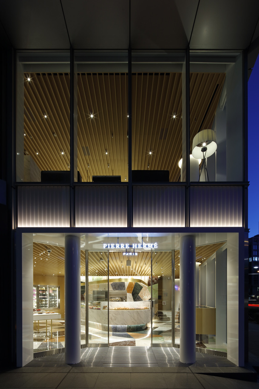
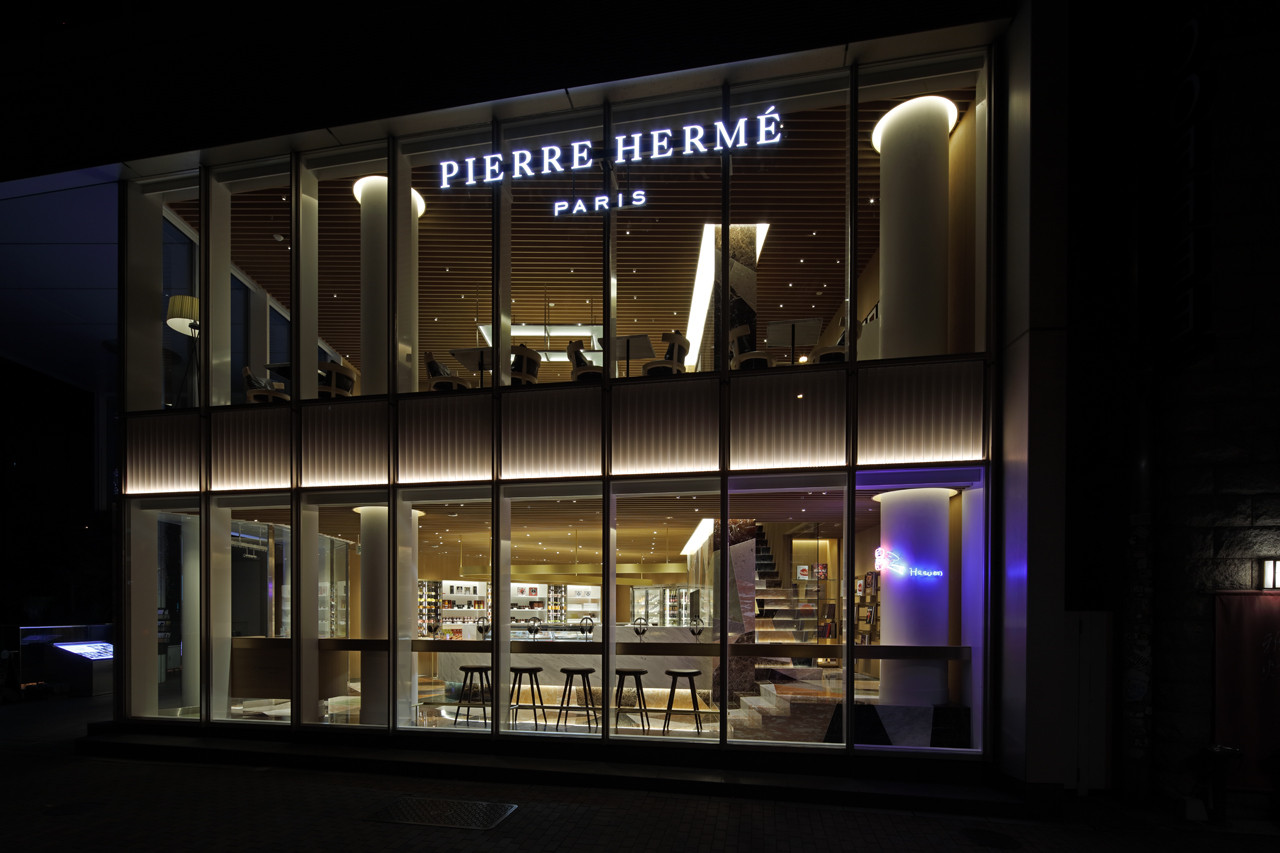
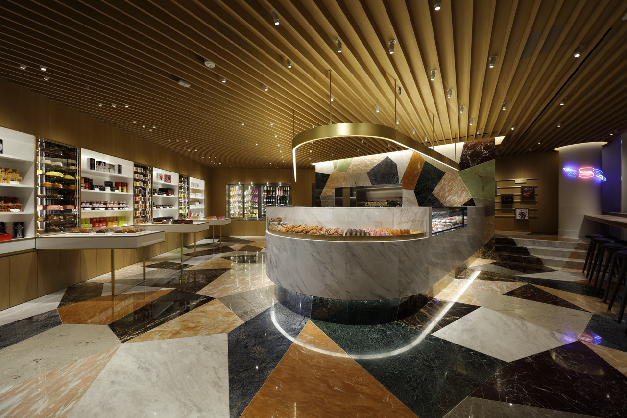
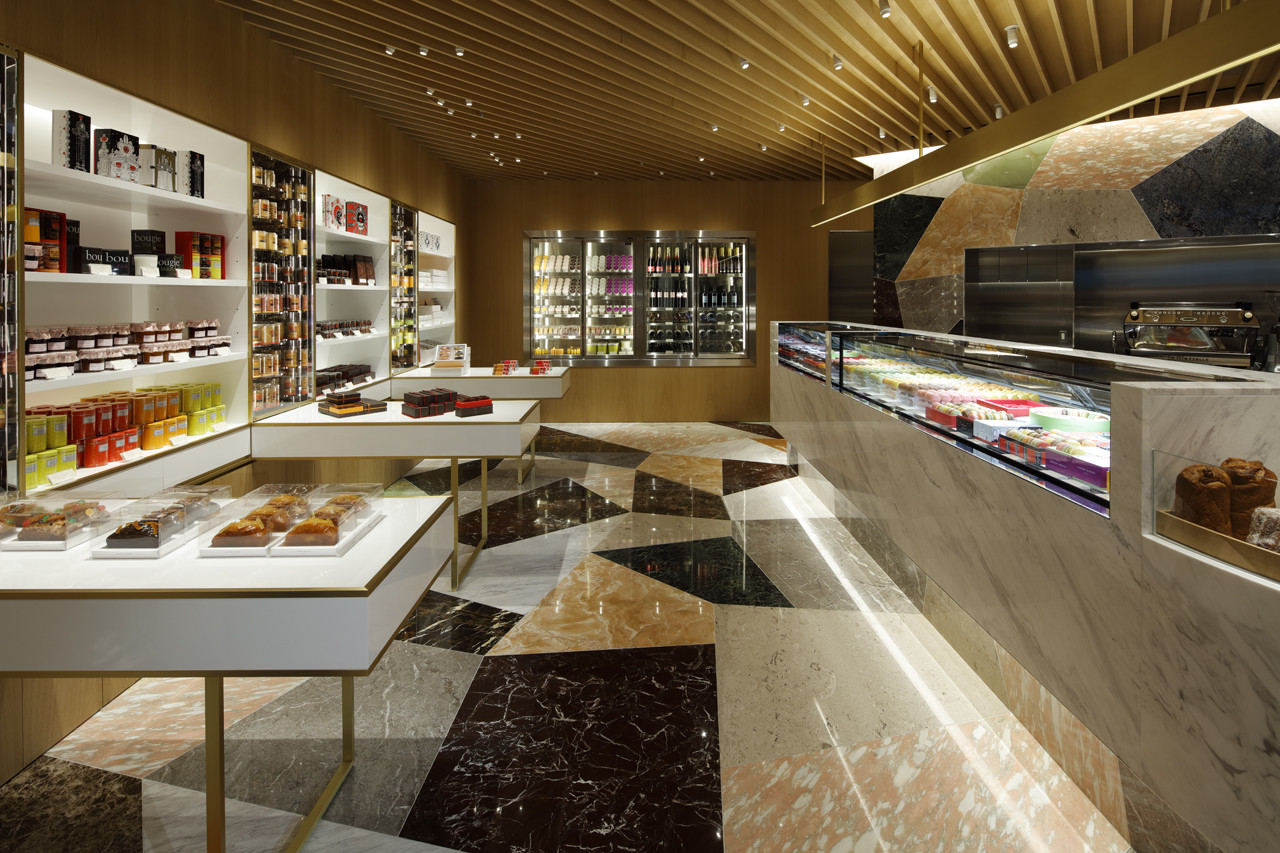
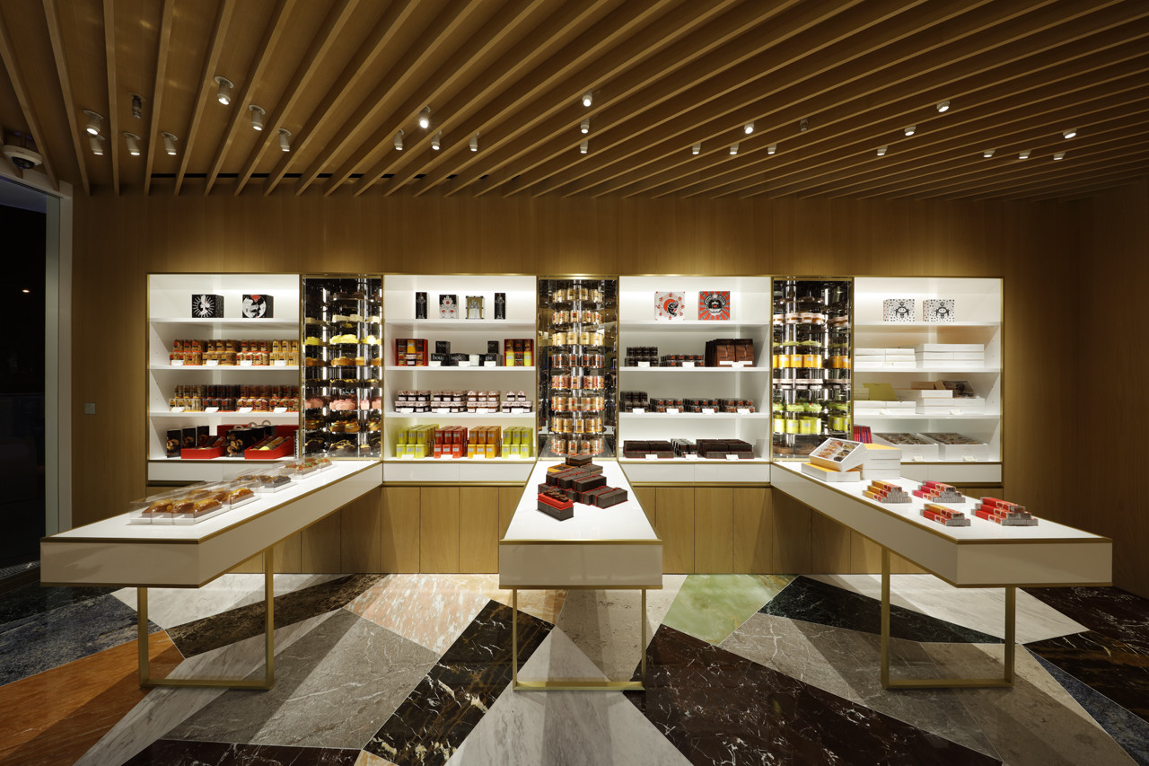
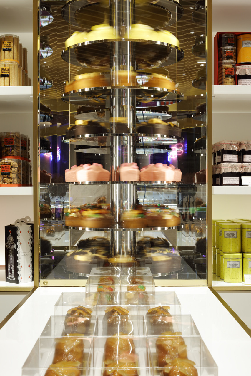
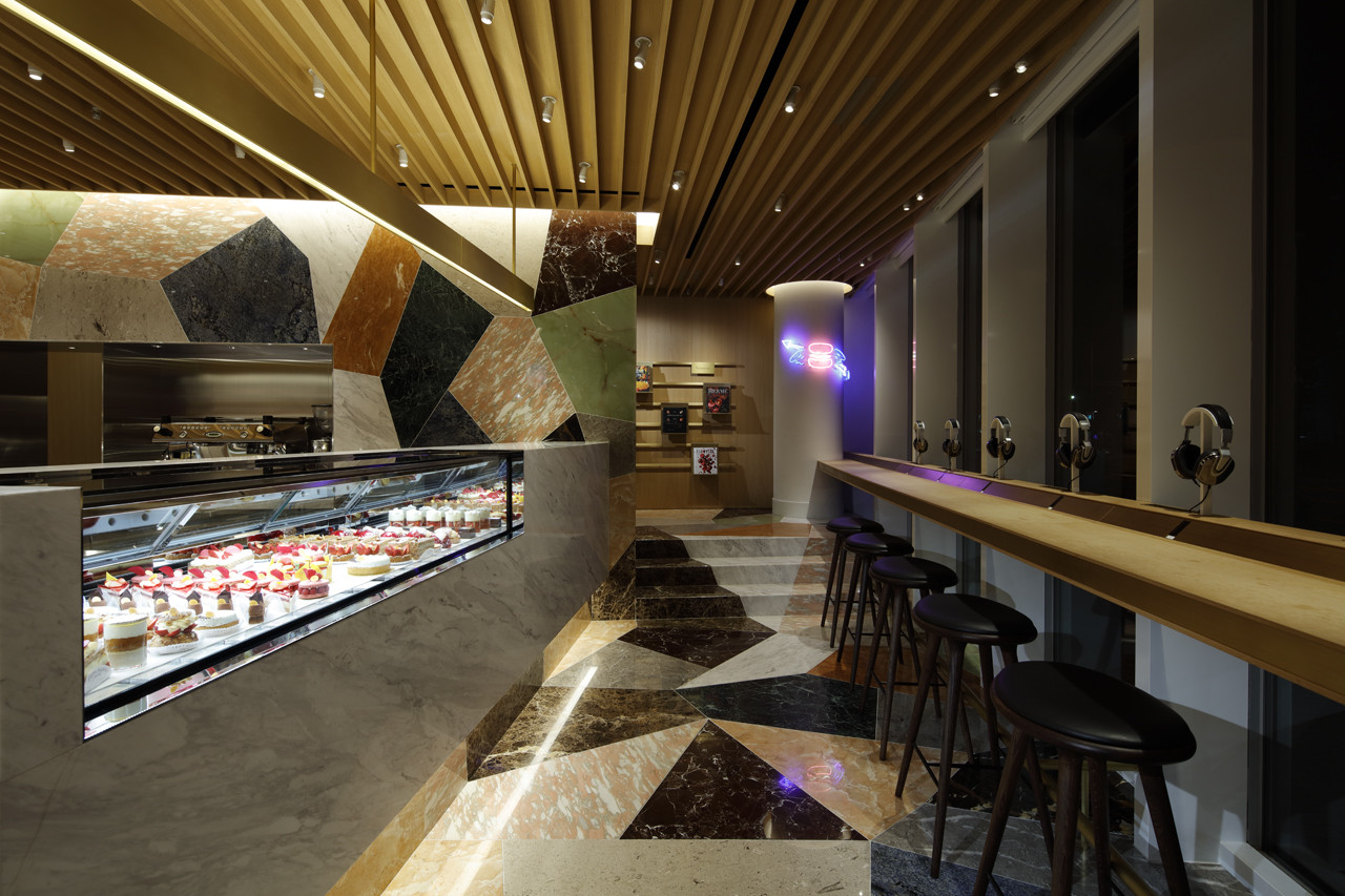
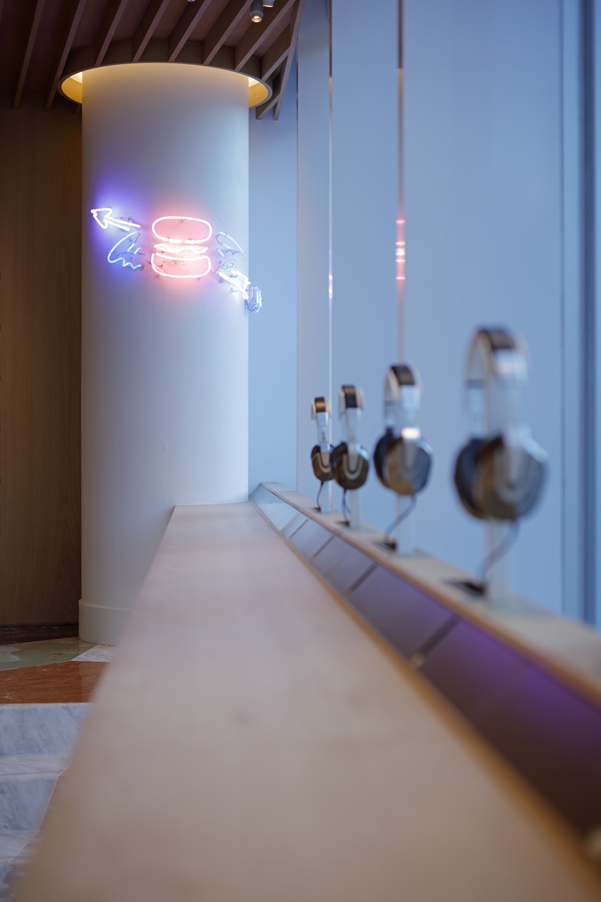
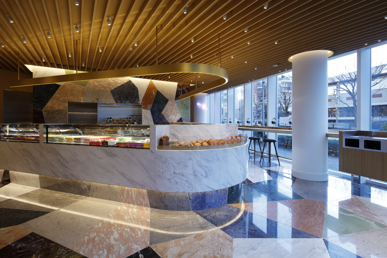
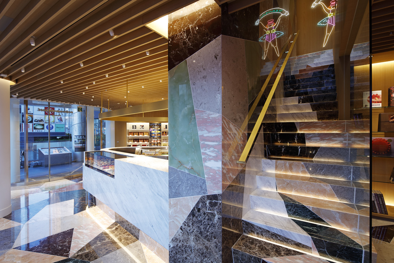
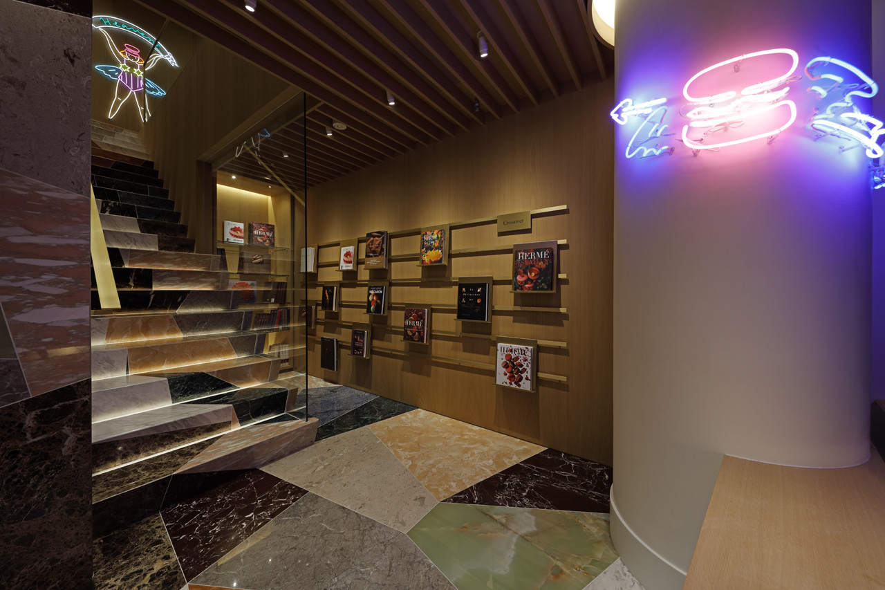
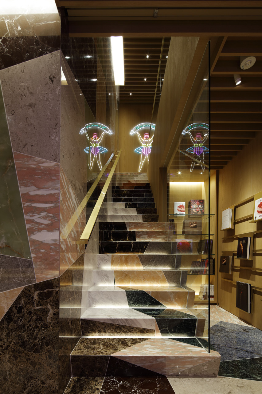
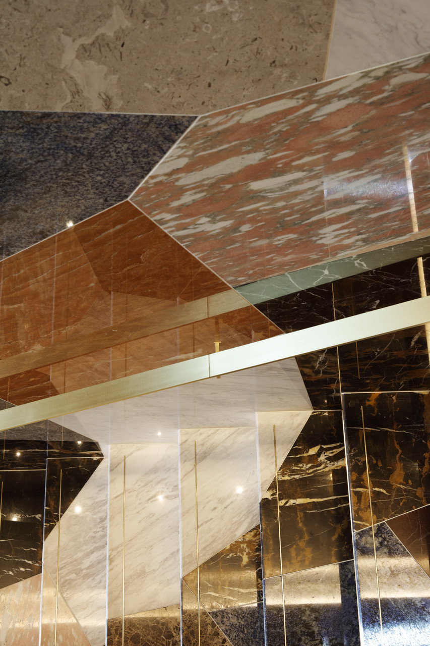
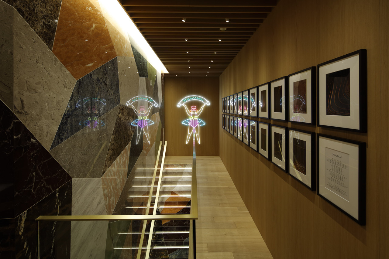
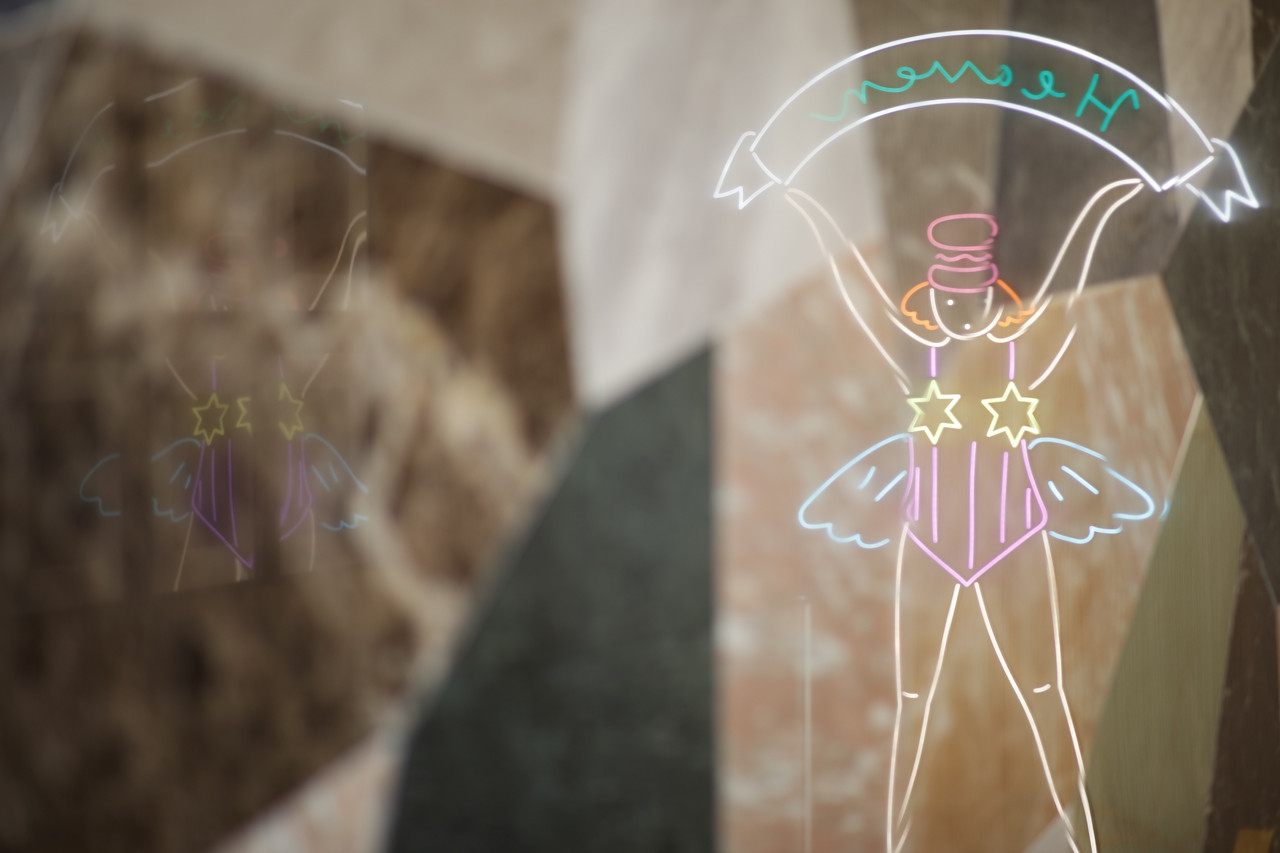
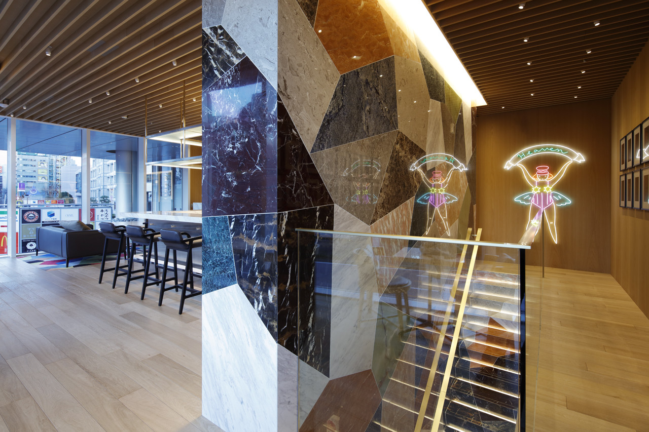
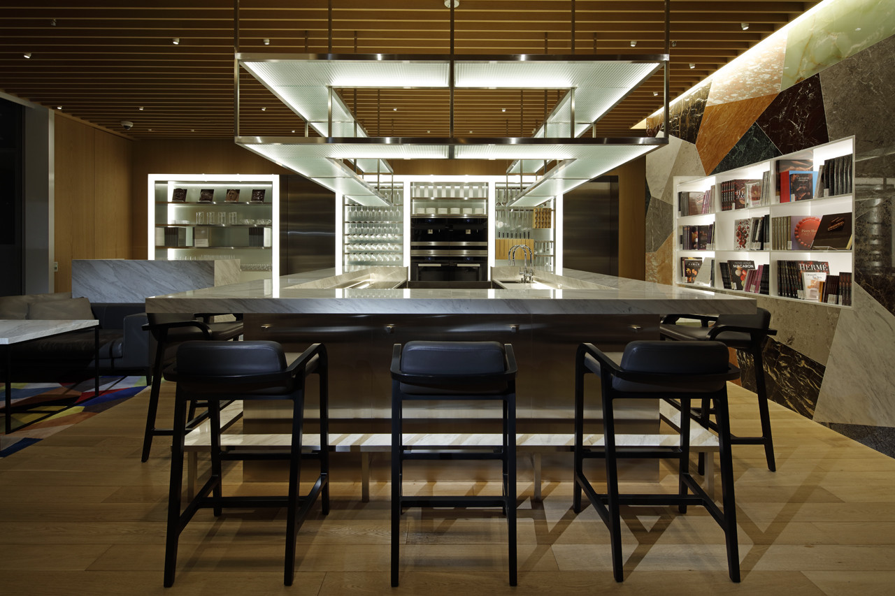
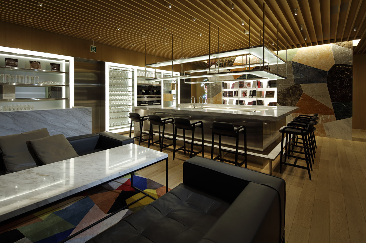
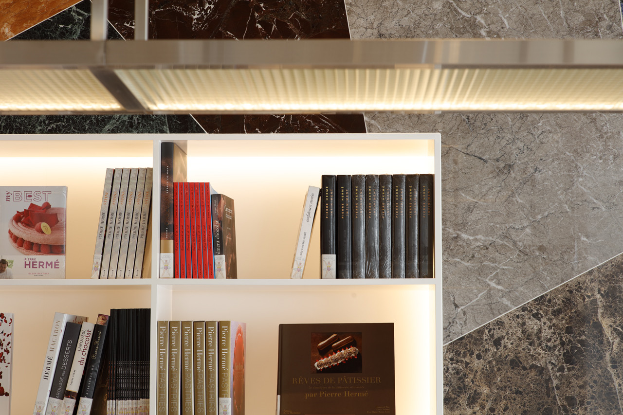
The boutique is a spatial interpretation of Pierre Hermé’s sense of ambivalence. It is an experiment in expressing the breadth of his world which ranges from acute precision to fantastic humor and playfulness. The design picks up on this concept in multiple ways: The symbolic wall surface connects the two levels which were designed using twelve different kinds of marble. The U-shaped showcase counter on the first floor is designed to engage and captivate the customer’s attention with products that are prominently displayed. The display shelves present the products so that they capture the eye from various angles and in different expressions, creating visual layers. Together, these elements create movement and fascination in the space, exploring and pushing the envelope in how the next-generation confectionery boutique should be. Furthermore, the design aims to establish Pierre Hermé’s identity: “sweets as a culture.” Examples of this can be seen in collaborations with NF’s Ichiro Yamaguchi for sound direction, and artist Makiko Tanaka for character design used in the neon lighting work. The project took the boutique’s original concept at the time of its 2005 opening, “the luxurious convenience store,” and transformed it into a new, evolved version.
PIERRE HERMÉ PARIS Aoyama(2016): 1F-2F, 5-51-8 Jingumae, Shibuya-ku, Tokyo
- CATEGORY:Retail / Goods
- Eatery / Cafe
- URL:
- COPYRIGHT:photo: Kozo Takayama
